Interview with Team Thursday graphic designers of State of Fashion Biennale 2022.

Can you tell us more about how you created the graphic design for State of Fashion | Ways
of Caring?
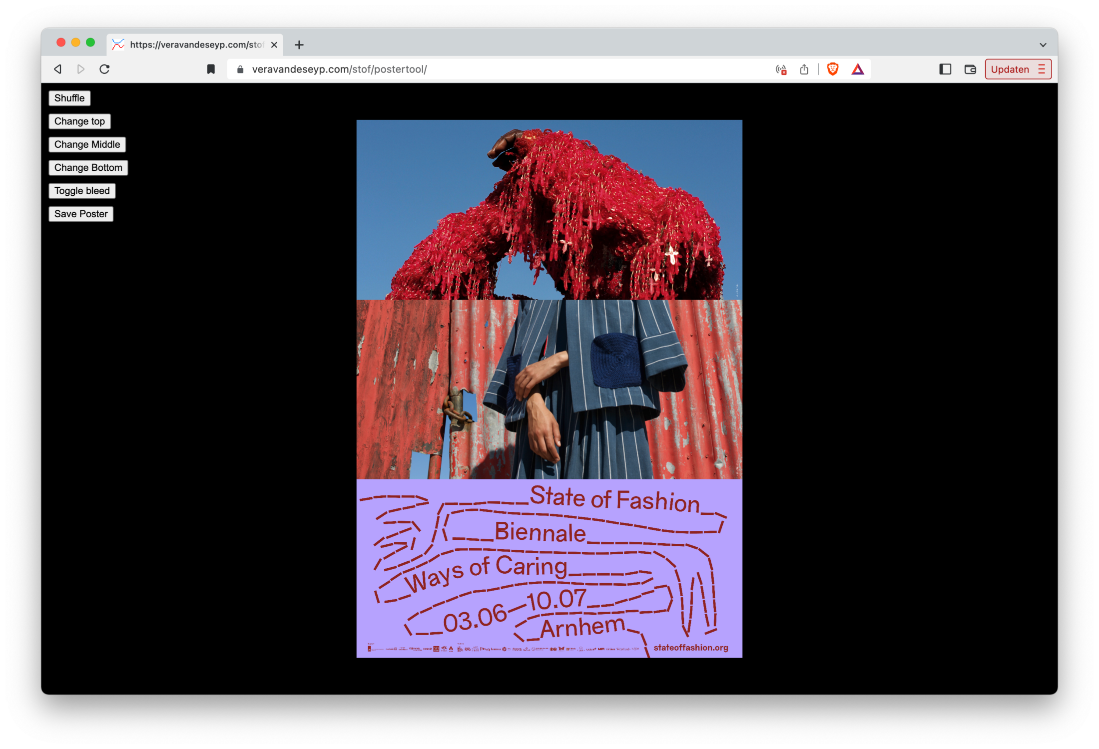
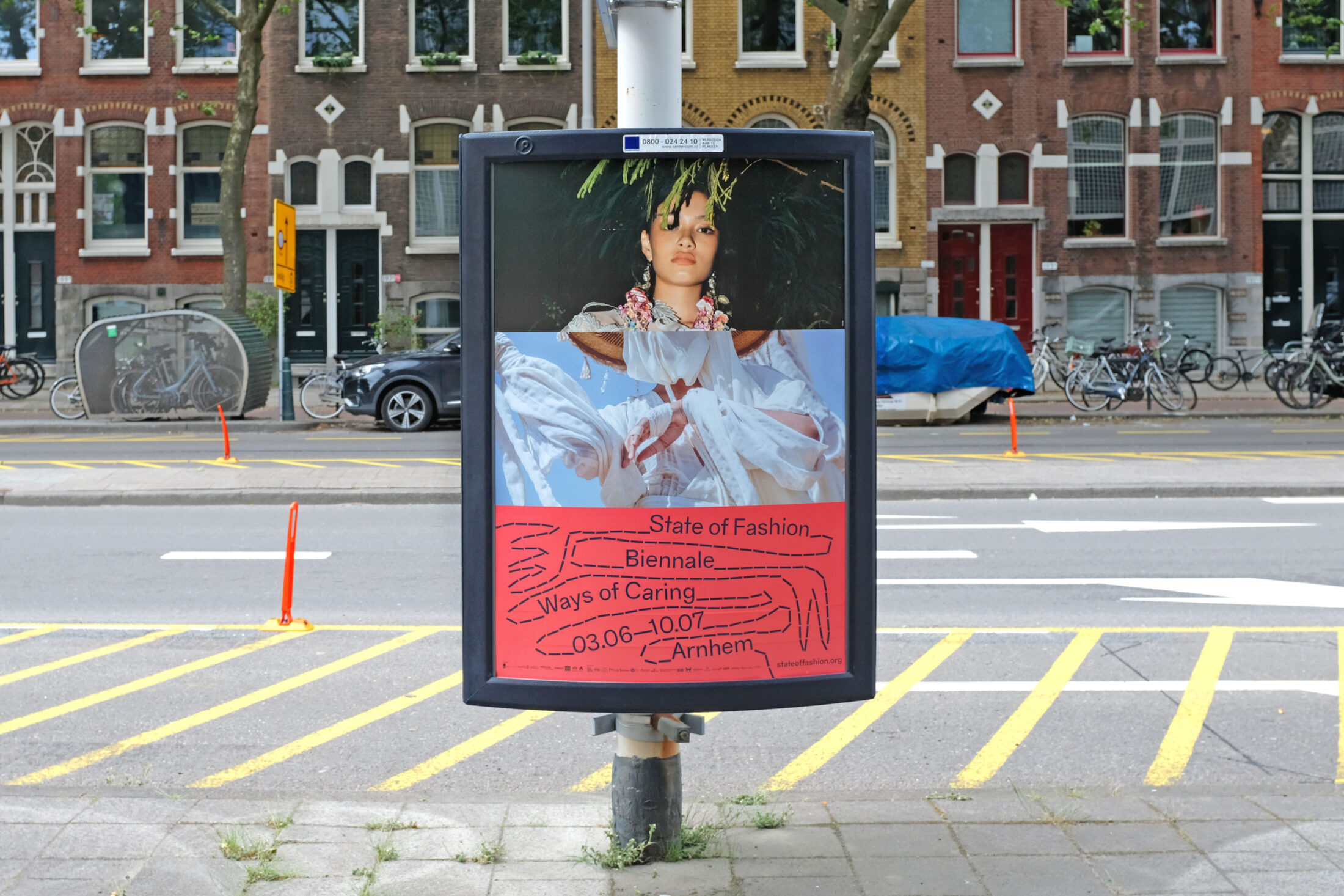
We got our inspiration from conversations with the curators of State of Fashion. It soon became clear to us that the design should not result in a campaign that was already a completed, fashionable image – since the biennale was not about that at all. We then looked for a way in which we could show all contributors in an equal way, and in a way that was in line with the workshops that would gradually supplement the biennale. The idea of the cadavre exquis, in our opinion, suited this well, because it contains chance and the game element, which were a good starting point. Surrealists such as André Breton created the cadavre exquis. It depicts people composing a drawing or poem without knowing what they are doing. We spent a long time deciding how it should look. Because State of Fashion is in essence a fashion biennale, we began creating collages with images from the participating designers and artists. This eventually grew into a large database containing all of the images, out of which we created a digital poster tool, together with Vera van de Seyp. With this, an infinite stream of unique posters can be created.
The interview continues below the photos.
How did you get started?
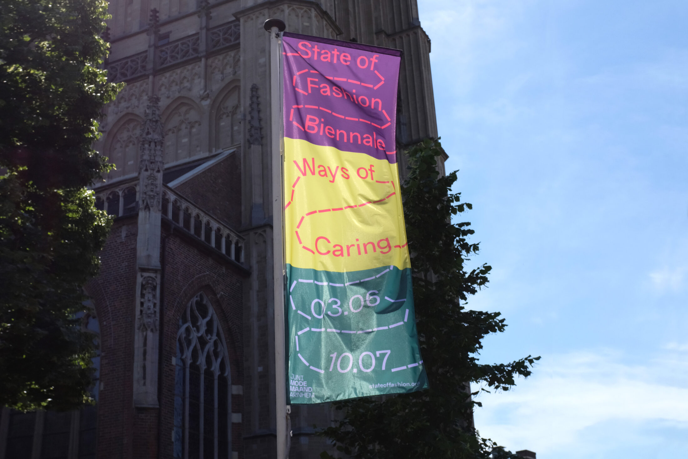
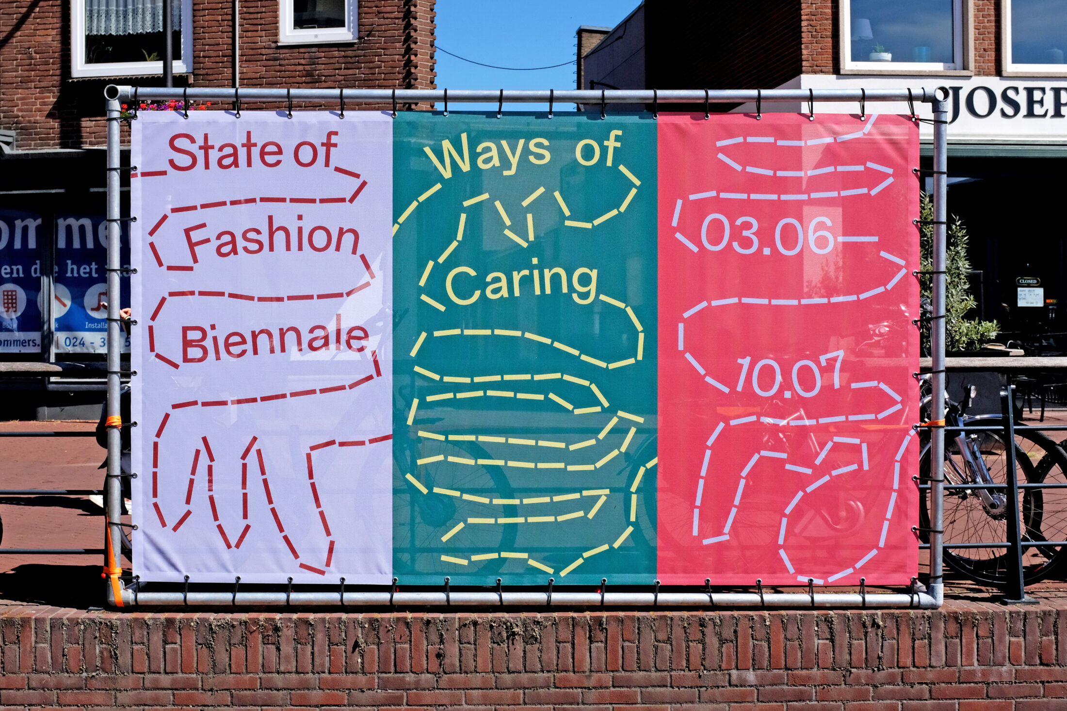
The conversations we had with the curators were very interesting to us, due to their openness. It made the process more special. We believe in strong visual expression, and the use of colour is crucial. That’s where we connected with the curators. For example, we talked about the color white, which is often used as a ‘neutral’ color. We wanted to embrace the power of color instead. These kinds of conversations and considerations are not immediately reflected in the final piece, but they are an important starting point in the process. We also think positivity in a design is essential and were pleased to see the final design is very festive.
The interview continues below the photos.
What message did you want to convey to the public?
In our work we always look for a multifaceted representation that goes beyond a singular view. In this case, the biennale was not completed as soon as it began but was supplemented by visitors over the course of several weeks. We were trying to trigger and activate the visitor. In order to question fashion, we also looked for a certain tension. The dotted line that appears in the design looks like an open end – there are numerous open spaces that refer to several unresolved issues in the fashion industry. We opted for open questions being addressed to the public instead of a ready-made response on a billboard.
Did the theme of Ways of Caring trigger you? Or has it brought a different vision to your work?
Although we have always been interested in graphic design’s sustainability, our collaboration with State of Fashion helped us to sharpen our focus. The State of Fashion curators were constantly thinking about whether or not to do something and how to do it sustainably. We found that sharpness very inspiring and now include this even more in our work. We strongly believe that if the design is good, people will take care for it.
Interview by Astrid Ubbink
